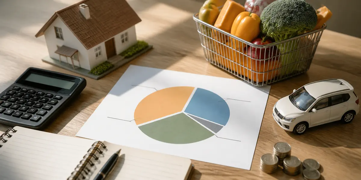
1. Housing — rent or mortgage, utilities, water/gas/electricity, internet
The biggest bucket, and the one that refuses to shrink. Korean urban worker households spent roughly 18–22% of monthly outlays here in 2025 figures; U.S. averages run closer to 32–35%. The two countries don't line up one-to-one — different ownership and lease structures — but the rank holds on both sides: number one.
2. Food — eating out + groceries + delivery
Korean households tend to land at 14–16%, U.S. averages at 12–13%. What inflates this bucket is dining-out and delivery. But crack open the budgets of people who say they \"cut food spending\" and it's almost always those two they cut — groceries barely move. Groceries are stubborn.
3. Transportation — vehicle, fuel, public transit, upkeep
Households with a car often run 10–13%; transit-only households drop to 4–6%. Personally, this is the scariest bucket on the page. You buy a car once, and it bills you every month. It's the clearest case of a one-time decision turning into a permanent monthly line.
4. Everything else — telecom, healthcare, education, leisure, miscellaneous
Dump the long tail into one bucket and you usually get 25–35%. This is where the most trimmable fat lives — and also where the most spending hides that never visibly hurts to keep. Six $5 subscriptions feels like nothing, but over twelve months it's $360 you notice once a year.
What you feel and what the data shows rarely match
Nearly everyone feels that food got the most expensive. The data usually points somewhere else: housing is the bucket that grew most. Why the illusion? Two reasons.
First, food bills hit you weekly. High frequency, and every receipt carries a small jolt of \"this got pricier.\" Second, rent or mortgage is one transaction a month, with zero per-meal emotion attached. So the bucket that's actually moving fastest is the one you feel least.
The fix: don't review by \"what felt expensive this month.\" Review by the 12-month total. Whichever bucket grew most year-on-year is the one to investigate first.
Reduced to one page
Installing a budget app won't, on its own, make you better at reading your household. Too many categories and it turns into pointless sorting labor. Once a month, thirty minutes, fill in these four lines. That's enough.
– Housing: this month's total ___ (vs same month last year ___%)
– Food: this month's total ___ (eat-out/delivery share ___%)
– Transportation: this month's total ___ (vehicle upkeep ___%)
– Everything else: this month's total ___ (number of active subscriptions ___)
Four lines, and the real reason a month felt tight shows up in a minute. The finer categories can wait — they're far easier to add later than to peel off once you've over-built them.