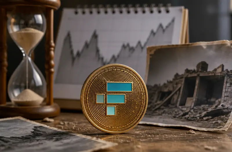
타임머신 — 과거 가격을 보고 현재까지의 변화 맞히기
10년 전 금값, 20년 전 코카콜라 주가, 30년 전 강남 아파트 — 과거 시점의 가격을 보고 '지금은 얼마일까?'를 추정하는 가상 시뮬레이션 모드입니다. 투자 권유가 아니라, 시간이 가격에 어떤 영향을 미치는지를 체감하는 학습용 게임입니다.
옛날이 싸 보이는 건 대부분 화폐 탓이다
이 게임 데이터를 채우면서 가장 자주 멈칫한 지점이 있다. 2000년 강남 아파트 33평이 3억원이었다는 줄을 적을 때다. 지금은 25억원이 넘는다. 머릿속에서 자동으로 "집값 미쳤다"가 먼저 튀어나오는데, 사실 그 8배 안에는 두 개의 전혀 다른 힘이 뒤엉켜 있다. 하나는 강남이라는 입지가 진짜로 더 귀해진 것(실질 상승), 다른 하나는 그냥 1원의 값어치가 줄어든 것(화폐가치 하락)이다. 우리 눈에 보이는 건 둘이 합쳐진 명목가격 하나뿐이라, 대부분은 이 둘을 분리하지 못하고 통째로 '비싸졌다'로 읽는다. 이게 명목가격의 착시다.
명목가격(nominal price)은 그 시점의 화폐 단위로 찍힌 액면 숫자다. 실질가격(real price)은 거기서 물가 상승분을 걷어내, 같은 잣대로 환산한 값이다. 통계청 화폐가치계산이나 한국은행 경제통계의 소비자물가지수를 쓰면 "2000년의 1원은 오늘의 몇 원"인지 환산할 수 있는데, 일반적으로 2000년 이후 한국 물가는 대략 두 배 가까이 올랐다. 즉 2000년의 3억원은 단순 물가만 따져도 오늘 기준으로는 그보다 훨씬 큰 구매력이었다. 강남 아파트가 8배 오른 것처럼 보여도, 화폐가치 하락분을 먼저 떼어내면 '진짜 비싸진 정도'는 그보다 작다.
같은 함정, 반대 방향: 닛케이 35년
착시는 오를 때만 생기지 않는다. 데이터에 일부러 넣은 손실 사례 하나가 이걸 정확히 보여준다. 1989년 일본 닛케이225가 38,916으로 사상 최고치를 찍은 바로 그 순간 들어갔다고 치면, 명목 숫자로는 35년이 지난 2024년에야 겨우 본전 언저리에 닿는다. 그런데 그 35년 동안에도 물가는 올랐다. 명목으로 본전이어도 실질로는 약 -60%, 즉 같은 돈으로 살 수 있는 물건의 양은 절반 아래로 쪼그라들었다는 뜻이다. "잃지도 않았는데 가난해졌다"는 이 기묘한 상태가, 명목값만 보는 사람에게는 영원히 안 보인다.
나는 이 닛케이 항목을 넣으면서, 사람들이 가격을 볼 때 0의 개수에는 예민하면서 '그 0이 찍힌 시점'에는 무심하다는 걸 새삼 느꼈다. 1989년의 38,916과 2024년의 38,916은 같은 숫자가 절대 아니다.
구매력으로 번역하면 숫자가 다르게 읽힌다
이 게임의 비교 문구들은 일부러 '돈'이 아니라 '물건'으로 환산해 둔다. 가격을 명목 액수가 아니라 구매력으로 옮기는 연습이기 때문이다. 예를 들어 데이터에는 이런 식의 환산이 들어 있다.
- 2000년 금 1온스 ≈ $280 → 같은 투자금이 지금은 '치킨 540마리' 수준의 구매력
- 2010년 삼성전자(분할 전) ≈ ₩800,000, 결과는 '스타벅스 930잔'
- 2024년 1월 비트코인 ≈ ₩62,000,000, 비교는 '스타벅스 460잔'
왜 굳이 커피잔과 치킨으로 바꿀까. '870만원'이라고 하면 그게 큰지 작은지 시점에 따라 감이 안 잡히지만, '스타벅스 몇 잔'은 시대가 바뀌어도 비슷한 생활 감각을 준다. 물론 커피값 자체도 오르니 완벽한 잣대는 아니다. 다만 명목 숫자 하나만 던지는 것보다, 구매력으로 한 번 번역해 보는 습관이 착시를 줄인다.
그래서 '옛날 가격'을 읽는 3단계
정리하면, 과거 가격을 볼 때 머릿속에서 이렇게 돌려보는 게 핵심이다. 첫째, 이 숫자는 몇 년도 화폐로 찍혔는가. 둘째, 그 사이 물가가 대략 얼마나 올랐는가(통계청·한국은행 지수로 어림). 셋째, 그걸 걷어낸 실질 변화는 명목 변화보다 얼마나 작은가. 이 세 단계를 거치면 "옛날엔 다 쌌네"라는 향수가 "그때 화폐가 지금보다 비쌌던 거구나"로 바뀐다.
✍️ 운영자 한마디 — 가격 연표를 정리하면서 나도 처음엔 '강남 8배, 비트코인 1만 배' 같은 큰 숫자에만 눈이 갔다. 생각이 바뀐 건 닛케이 줄에 '명목 본전, 실질 -60%'를 적어 넣던 순간이다. 가격은 자(尺)가 두 개구나 — 하나는 액면, 하나는 구매력. 그 뒤로 옛날 가격을 보면 일단 "이거 몇 년도 돈이지?"부터 묻는다.
이 글과 게임은 특정 자산을 사거나 팔라는 투자 조언이 아니다. 등장하는 가격·수익률은 화폐가치와 인플레이션 개념을 설명하기 위한 과거 사례이자 단순화된 시뮬레이션이며, 실제 거래 결과나 미래 수익을 보장하지 않는다. 이 게임의 점수·기록은 학습용일 뿐, 실제 사용자들의 투자 성과 통계가 아니다.
이 게임으로 무엇을 배우나요?
- ✓복리(연 7~10%)가 30년·50년에 걸쳐 만들어내는 '눈덩이' 효과를 직접 시뮬레이션
- ✓동일 자산이라도 출발 시점(예: 1990년 vs 2000년)에 따라 결과가 얼마나 달라지는지
- ✓장기 차트의 '생존자 편향' — 살아남은 기업·자산만 화면에 보인다는 사실 인지
- ✓인플레이션을 보정하지 않은 명목 가격과 실질 가격의 차이
데이터 출처
장기 가격 시계열은 Robert Shiller의 S&P 500 데이터(예일대 공개), 한국은행 장기 통계, World Gold Council·BLS·KOSTAT 공개 자료에서 가져옵니다. 표시되는 모든 수치는 명목·실질 가격 중 하나로 명시되어 있습니다.
한계와 주의사항
이 모드는 '가상 시뮬레이션'입니다. 실제로 그 자산을 30년 보유하는 것은 세금·수수료·환매 제한·심리적 부담 때문에 매우 어렵습니다. 결과 화면의 수치를 '내가 그때 샀더라면'으로 해석하지 마세요.
자주 묻는 질문
왜 인플레이션을 따로 보여주나요?▶
1990년의 1만원과 2026년의 1만원은 같은 1만원이 아닙니다. 명목 수익률이 커 보여도 실질로 환산하면 절반 이하가 되는 경우가 흔합니다.
결과가 비현실적으로 좋아 보입니다.▶
선택된 자산(살아남은 대형주, 우상향한 도시 부동산)은 '사후적'으로 잘된 사례입니다. 같은 시기 사라진 기업과 정체된 지역은 화면에 나오지 않습니다 — 이게 생존자 편향입니다.
관련 글
⚠ 교육·엔터테인먼트용 게임입니다. 어떤 자산에 대한 매수·매도·보유 권유가 아니며 수익을 보장하지 않습니다. 실제 투자 결정은 규제 받는 중개사·공식 공시·자격 있는 전문가 자문을 직접 참고하세요.