A chart is just a picture of prices — we said that earlier. Reading that picture well takes a surprisingly small set of basics. This article isn't about becoming a chart expert. It's about not being fooled by the graphs in news and quizzes.
1. Axes
The simplest thing. X is time, Y is price or return. Yet you'd be surprised how many social-media charts skip date labels or unit labels entirely. Without units, a chart is decoration.
2. Start and end — "from when to when?"
Two charts of the same asset can tell different stories because they start at different points. A chart beginning at the 2022 low vs. one beginning at the 2008 peak is a whole different narrative. The first question about any chart is always: "What range does this cover?"
3. Linear vs. log scale
If the Y axis steps 0, 10, 20, 30 evenly, it's linear. If it steps 0, 10, 100, 1,000, it's log. Log scales make percentage moves visually consistent, which is why they suit multi-decade views. On short charts, log usually exists for drama.
4. Adjusted price vs. nominal price
The most common confusion on stock charts. "Adjusted" closes bake in dividends and stock splits so that long-run returns can be compared cleanly. If you read raw closes across a split, the price appears to fall by half the day after — the economic value is unchanged, there are simply twice as many shares. Always compare on adjusted prices.
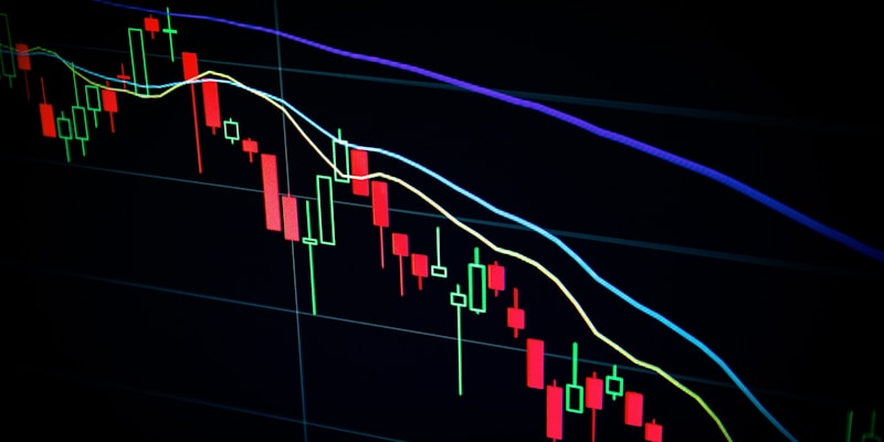
5. Moving averages (MA)
Smoothed price. 20-day, 50-day, 200-day MAs let you compare short- and long-term direction. Not essential for quiz play, but worth recognizing when reading news charts.
6. Volume
Usually a small bar chart under the price. Volume helps judge whether a move happened on broad activity or on a few big trades.
7. Classic traps
"-30% from the peak" — meaningless if the peak was a bubble.
Non-zero Y-axis — visually exaggerates changes.
Weekends included vs. excluded — trading-day vs. calendar-day charts look different.
No currency label — USD charts and KRW charts diverge by whatever FX does.
Using this on the Chart Quiz
PriceGuess's Chart Quiz shows demo paths simplified from real historical shapes, with dates and absolute prices hidden. So the job isn't to remember a specific ticker — it's to classify the pattern. The most common families:
Steady compounders (think Amazon, Apple shape)
Bubble-and-crash
Long consolidation, then breakout
V-shape — sharp drop, sharp recovery
Filing charts into these four shapes raises quiz accuracy noticeably. Reading charts well is classification, not memory.
※ Educational basics only — do not use this as trading research.